
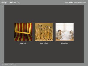
Melbourne is one of our large-image driven "scalable designs." By using modern HTML 5 - based technology, your website will display images beautifully on all monitor sizes. No Flash plugins required. HTML 5 compliant sites are the future of dynamic web presentation and display great on mobile and tablet devices as well.
We've built a dynamic image-display system with Melbourne that allows your images to fill up your screen on large and small monitors without cropping into images or forcing users to scroll up and down to see the detail on large images. Image captions and a thumbnail tab display when hovering over images, maximizing the image detail on your pages.
We've built a dynamic image-display system with Melbourne that allows your images to fill up your screen on large and small monitors without cropping into images or forcing users to scroll up and down to see the detail on large images. Image captions and a thumbnail tab display when hovering over images, maximizing the image detail on your pages.
For this example site, we've uploaded images at 2,560 pixels wide and 1,440 pixels high (that's the size of a 27-inch monitor). To keep the download sizes down, we used Adobe Lightroom to process the images and set the maximum export size to be 150k per image. The images still look great, but are sufficiently compressed to download quickly. It's important to compress large JPG images sufficiently to speed up download times - otherwise, your site will download slowly and display transitions unevenly.
For our font choices here, we've used Open Sans for the navigational links and text. Both are set at 18 pixels. The text font uses a "+2" line spacing. For the "MELBOURNE" logo, we've chosen the Source Sans Pro font, set at 24 pixels. Open Sans is part of our new Google Webfonts choices.
For gallery display, we've turned on the "autoplay" option with a three second delay on each image. Clicking the forward or back arrows (or navigating with the thumbnails) turns off the slideshow. A button at the bottom of the images starts up the slideshow again. Try using the forward and back arrows on your keyboard - this will also navigate through the images.